About Me

My Photo
Hull, East Yorkshire, United Kingdom
Showing posts with label elusive images. Show all posts

Saturday, 8 December 2018

Some of this years Christmas cards


I always make batches of Christmas cards, I find it easier and I'm less likely to run out of inspiration and good ideas.
These are the cards I've made for close family members ( parents, in laws and kids).

In green


Dark blue.


Light blue
 Purple


Papers are from a CD by Elusive Images ( now Chocolate Baroque) called Artilicious Christmas Greetings.
Dies are
Poinsettia...Spellbinders
Holly Stems...Marianne Designs
Fir tree branches...Joanna Sheen
Snow Flakes...The Works.
Small branches are a punch.
 Sentiment stamp is by Creative Expressions

Thanks for popping in x

Saturday, 14 June 2014

Simply Less is More # 176

Hello There!

First I`d like to welcome Ileana, my new follower. Thank you for choosing my blog to follow and there is no need to apologise, your english is terrific. 100% better than my Italian :)

The challenge this week at Simply Less is More is One Layer, Off the Edge. Nowhere near as daunting as the last time we had this challenge way back in week 6. I`m hoping my designs have improved with time too.

A fluttering of butterflies trying to escape lol.
I used one of the butterflies from Elusive Images ( now Chocolate Baroque) butterfly set. I masked the bottom one but then gave each of them a tiny bit more space as they reached the top of the card, stamping each one `Off the edge`. Then coloured them using the brightest markers I could find.
I added a bit of chrystal Glamour Dust to their bodies for some sparkle.
The sentiment is a joint effort, Birthday is Layers of Color and Wishes is Flourishes. org.

Well after a few days of glorious warm sunshine, we awoke this morning to cloud and drizzle. Perfect for crafting but not so nice for anyone trying to enjoy the great outdoors.
One thing I`m appreciating more and more since leaving work is being able to spend more time in the garden just watching the birds and wildlife. We have regular visits from Blue Tits, Gold Finches and a pair of Robins and we have a resident field mouse that keeps us amused for hours. We have an old toilet that I`ve planted up which sits in a corner of the garden and Mr Mouse has taken up residency there. He has a burrow which runs from the front of the toilet to the bit where the cistern should sit and he steals bird and fish food and hides it away in there. We also have a small bird house which hangs on the fence quite near the toilet and he climbs the fence to get at the mealworms in fat that I put in ( sounds like something from I`m a Celebrity).
As long as he stays in the garden and doesn`t decide to migrate to the house, I`m quite happy.
I`m sure many of you have much more exciting visitors than us but considering we live right on the edge of an industrial estate, it`s not bad going.

Thanks for popping in ...Lynne xxx

Monday, 19 November 2012

Deck the Halls

Good Morning All!

I`m in Christmas mode now. I`ve got most of my presents bought and am now frantically making cards.
Here is one I made over the week end.

I stamped and heat embossed the image from Elusive Images (now Chocolate Baroque) onto the base card.
Masked a rectangle with post its and inked the background with Antique Linen DI, Versacolor Sandstone and a litle bit of Versacolor pink.
I added some various sized red gems for the berries then made a frame using SB Rectangle Dies.
The sentiment is from the same stamp set, stamped and heat embossed.

Thanks for popping in...Lynne xxx

Sunday, 14 October 2012

Autumnal Butterflies

Good Morning All!

It`s One Layer week again over at Simply Less is More and this time the theme is WINGS.

I`ve taken the easy option and gone with butterflies.

I`ve used white linen card and embossed a rectangle using a nestie.
I stamped the butterflies (Elusive Images) onto the rectangle then masked off the butterflies and around the rectangle before inking with Versacolor Sand all over then Versacolor  Brown around the edges.
The image is coloured with Promarkers in autumn colours.
The sentiment is from There She Goes which was a gift from my lovely blog friend Tara ( Thanks Tara)

Although one layer cards don`t hold the fear they once did for me, I`ve come to the conclusion that mine are getting much of a muchness so I might have another go with something a bit different.

Thanks for popping in...Lynne xxx

Monday, 19 September 2011

It`s beginning to look a lot like...

...Christmas in the loft now. Autumn didn`t last long did it?
This is my 4th card for this weeks Less is More 
marathon entry challenge and I`m feeling festive.
The image is by Elusive Images
(now Chocolate Baroque) coloured with Promarkers and cut out with a circle nestie. Placed, using foam pads onto a larger circle nestie which is also placed using foam pads.
Sentiment is by Creative Expressions.

The entries are going strong for this challenge but if we`re going to make 1000 I`m going to have to get my finger out lol. If there`s anybody reading this who hasn`t had a go yet, try it! It`s a really fun challenge and a great community. Just give it a go.

Thanks for popping in...Lynne xxx

Wednesday, 1 June 2011

St Lukes Charity Card Challenge June...Come Fly With Me...

Helloooo it`s the 1st of June and that can only mean one thing....a brand new challenge at St Lukes Charity Card Challenge

This month we are asking you to make a card with the theme of flying...any style but include something that flies...Birds, Butterflies, Fairy, Angel, Plane, Hotair Balloon or even Pegasus!

Here is my make,

I have small confession to make. Because this is for such a worthy cause and because I`m on the DT, I wanred to make something a bit different. I wracked my brains but couldn`t come up with any inspiration at all and was getting a bit worried that I wouldn`t have anything to show. As late as yesterday morning I still hadn`t produced a card. While blog hopping during my morning coffee I logged onto Becca Feekans blog where she was showcasing THIS card and I just knew I had to case it.
Now mine is nowhere near as beautifully engineered as hers is, that girl must have a secret degree in engineering in my opinion as she can do the perfect mitred corners. But having said that, the end result is quite pleasing.

The base card is burgundy .
I used a Martha Stewart Trellis border punch and really used guess work for the sizing.
The butterfly is Elusive Images stamped onto dark red Vellum using clear ink and red EP.
The circle is cut out with a nestie. I`ve added some flat backed pearls the the body and also the 4 corners.

Don`t forget to join in with us at St Lukes . You`ve a whole month to get your entries in so there`s no pressure. Please visit the other DT members too and check out their awesome creations

Saturday, 21 May 2011

Less is More # 16 Butterflies

Good Afternoon All!

Yes, it`s Less is More 
day once again. Is it me or are the weeks going waaaay too fast?
This week we are asked to make a CAS card using butterfly/ butterflies. Wow, it doesn`t get much better than that and not much of a challenge to most of us either me thinks.
Funnily enough I`d been playing around with my Twinkling H2O`s a couple of weeks ago. I simply slapped some of the paint onto some white paper, gradually adding water to get a graduating colour effect. When it was dry I stamped some butterflies on it in Versafine ink, cut them out then didn`t do much else with them.
Susan Raihala gives a great tutorial on how to do this effect. Check her out, she is amazing.
I also want to point out one more thing. I needed some EP during the week so put an order in at Joanna Sheen. Because she has a £5 spending limit ( understandably) I treat myself to a new Embossing folder as well. I placed the order just before lunch on Thursday and the postman delivered it on Friday morning. Hows that for brilliant service and P& P free too. Thank you Joanna!!!

Anyway onto my card.

I`ve used my new Cuttlebug EF, Leafy Branch straight onto the card front.
The Butterflies are by Elusive Images and done in Twinkling H2O`s as I said and I`ve added some gems to give it a bit of Pizzazz.
The sentiment is ofcourse by Flourishes Tag Lines Stamped in Memento Bahama Blue.

This is my first card, I`m already working on a second ( sorry Mandi & Chrissie) but I promise I won`t go overboard like I did last week lol.

Thanks for popping in...Lynne xxx

Colour Throwdown # 142

Happy Saturday All!

It`s ages since I`ve had the chance to join in at Colour Throwdown but when I saw this weeks colours I just had to have a  go.
 What a brilliant colour pallette this is.


Here is my card,
It was a bit trickier than I anticipated,trying to get the colour right but I was a good girl and persevered.
White base card.
Grey card run through the Cuttlebug with a Crafts too Damask folder then matted onto Black card.
I tried stamping and embossing with versa color Lime and clear EP but it looked too wishy washy so I stamped in a combination of clear ink and versa colour Lime then embossed in Lime EP. Ofcourse the two Limes were different shades but I think the end result is much brighter and clearer.
The stamp is Elusive Images Damask Background and I matted that onto black card too.
The label is Waltzing Mouse Vintage Labels 4 stamped in Black Versafine and embossed in clear EP, cut out with a nestie labels 4 die. The sentiment is from Flourishes Tag Lines.
A piece of black ribbon to finish.

I`ll keep it short and sweet as I`ve got a busy day ahead. See you later.

Thanks for popping in...Lynne xx

Monday, 16 May 2011

And yet another one...

....card for Less is More 
that is.
Before I show you my card I would like to thank you all for the comments on my previous post. Looks like the plain one gets the yes vote.
Todays card is on a similar theme in as much as I made one card, photographed it then added a ribbon and photographed it again. I`m sure I never used to be this indecisive, must be my age lol.
So, without further ado,
What do you think?

Without?
Or with?


I added the black ribbon because I love Lime and Black together but now I`m not so sure.
I think it might have been better with a slightly wider ribbon.


Stamp; Elusive Images Damask.& Flourishes Tag Lines
Ink;      Versa colour Lime & Versafine Black
Clear EP

Please let me know if you`re getting fed up of lots of posts for this challenge. I know how difficult it is to keep commenting on every post and how busy every one is.

Thanks for popping in...Lynne xxx

Tuesday, 12 April 2011

Less is More # 10 2nd go & some questions answered.

Hello everyone.

I`ve made two more cards for this weeks challenge at Less is More. I`ll show the cards first because it might turn out to be a long post.

I had intended to do a boy version of my first card but it didn`t work out, more about that later.
This has to be one of the quickest cards ever. It took me longer to find the stamps than it did to actually make it.
I first stamped the bird from Inkadinkadoo in Baby Blue Versacolour. Then stamped the verse from Flourishes Gerbera Daisy set in Black Memento.
I wanted the bird very pale so it didn`t take the eye away from the sentiment. For once I`m really pleased with this one.


My second card is on similar lines to the first.
The flower stamp is by Elusive Images (now Chocolate Baroque) stamped with Versa Colour Orchid.
The sentiment is from Flourishes Sweetpea stamp set.

Another really quick and easy card.

When the Less is More challenge first started and Mandi and Chrissie said they wanted OLC I was terrified. Well maybe not quite terrified but the thought did scare me.
I have always said that my one layer clean & simple cards looked naked but now I`ve had some practise and seen some of the creations of other Limettes ( love that name,sounds like a 60`s girl band) I`m really getting into it and am doing more and more for my own enjoyment not just for the challenges. Thank you girls for giving me the confidence and inspiration.

Now, onto other things. I said yesterday that my printer was playing up. Now, I think it`s in it`s death throes.
I spent most of yesterday evening cleaning the nozzles, printing out loads of sheets to get the colour through, thought I`d got it sussed but then when I tried to print out a card with the word BOY in blue, it came out pink.
It is, in all honesty, a cheap Lexmark all in one and I have used it for a few years so I think it`s paid for itself. I could have done with it lasting just a little bit longer though. I do a little cleaning job on a wednesday morning and the money I get from that was to buy some new stamps and other crafting goodies, so I`m a bit upset at having to fork out for a new printer. Never mind, these things are sent to try us...

On to some questions that some of my lovely blogging friends have asked.

Katina wanted to know how I propped up the card when using coloured backgrounds. Well, I can tell you this is a very technical thing to do ( not )

 I just prop one piece of card against the tubs that hold my tools and scissors and the other lays flat. It was the only thing I could think of at the time and it works a treat, and costs nothing lol.

Mustavcoffee asked if I had a little Pixie to hold my cards for me.
Well, yes doesn`t everyone?
Mine is a rescue pixie. I liberated him from an old shoemaker in town where he was expected to make all the shoes for the old man to sell. Poor little mite had to work 12 hour night shifts and work by candlelight for no money. One day I went in and sneaked him into my handbag and brought him home. He now has a life of riley and readily holds my cards for me while I photograph them in return for free board and lodgings and as many cups of tea as he can manage.

 Although he does like to play with my punches, ( he thinks its great fun to jump as hard as he can a bit like a trampoline) I just put it there so you can see his tiny cup and tea pot. I do have a problem finding tiny teabags though...

So now you all know I`m just as barmy as the rest of you lol.


After a really manic weekend I will try and get around to commenting on the rest of the entries. Last time I looked there were well over 100 so it make take some time.

Thanks for popping in...Lynne xxx

Thursday, 10 March 2011

Less is More #5 x4

Hello All!

I hope your thursday is going well.

I`ve decided to enter yet another card into this weeks Less is More challenge.If any of you think that this is getting a bit obsessive then I think you might be right,lol.

After my first disaster, a redo then a badly photographed third attempt I thought I`d give it one last go. Trouble is, now that it`s done I`m not sure if it`s CAS enough or even pastel (ly) enough but I`m sure you`ll let me know.
I made two of these cards, one for my Mum and one for Alan`s Mum.

Both the same so only one piccy.

I did make a card very similar to this a few weeks ago but kept it white on white so this is a little different.

Really simple card, white base card, slightly smaller panel run through Cuttlebug Birds and Vine folder raised with foam pads.
Ribbon border is by Marianne designs with yellow ribbon threaded through.
Handmade yellow flower with clear gem brad.
Sentiment by Elusive images, cut up and cutout with nestie label die.


Well not much to report from the loft. Alan`s Mum is doing better although she`s still staying at his sisters house. My back is a bit better but golly I know when the painkillers are wearing off. and that`s about it really.

Thanks for popping in...Lynne xxx

Saturday, 19 February 2011

Less is More #3 Spring.

Good afternoon all!

I hope I find you well and the weather isn`t too bad where you are. It`s pouring down with rain here and freezing cold but we did manage to avoid the snow thank goodness. I can`t believe last wednesday was so spring like, warm(ish) sunshine all day. I`d convinced myself that spring was here to stay. Just shows what I know eh!.

Which brings me nicely to this weeks challenge over at Less is More
the theme this week is spring.
Here is my card,

 Now if anyone dares to tell me that CAS cards are quick and easy, they just might get a slap. This one has taken me hours. It`s not as if I don`t do CAS, I do. I like CAS.
It started when I tried to do my sentiment on the PC. Thats something else that I do quite often but usually I cut them out with nesties. This time I wanted it at the bottom of the card but my software has such a large margin where it won`t print that it finished up nearly halfway up the card. I don`t have word installed on this PC, maybe I should get it. After 6 failed attempts I resorted to inking up my trusty Flourishes Tag Lines again.
Then I coloured my tulip, which is by Elusive Images and is part of a medalion set, in maroon.
Looks gorgeous but somehow not quite spring like enough.
I stamped the tulip again and got a blob of ink alongside the image, so 3rd time lucky I decided to go with golden yellow and highlights of orange.
Even the scalloped border along bottom didn`t go right first time but luckily the swiss dots folder is long enough for me to cut a bit off the bottom and do it again.
 Anyhow this is the finished result and I`m pleased with it. I did have a moment with Mr Blogger but that`s sorted now. Phew!!!
The ribbon btw is from Poundland.
I`ve just cremated the chicken we are having for tea so I think it`s time to post this and I`ll be back later to show off with some awards I have been given.
Thanks for popping in...Lynne xxx


Monday, 7 February 2011

Another Valentine`s card, A brand new challenge blog and an award.

Happy Monday All!

I have today off so it`s very happy for me. All my household chores are done so I`m crafting..yaaaay!

While visiting you all over the weekend I popped into Sarita`s Blog 
to check out her latest stunning creation. If you haven`t already found Sarita, check her out, she does the most amazing artwork. Anyway while there she told us about a brand new challenge blog called Simply Less is More.
The remit is CAS, clean and simple with lots of white space and, this week, using Black, Pink and White.
Sooo I just had to give it a go didn`t I. This is what I came up with.

This has to be the quickest card I`ve ever made. I must admit I found it quite diffucult to stop myself adding just a few pearls or gems or maybe a bow but I was very, very good and stopped at clean.

I used one of the Elusive images hearts with flourish stamped on black card and embossed with pink EP and placed it using foam pads.
My sentiment is Flourishes Tag Lines stamped in black.
I scored some lines just above the sentiment to give it some texture and that`s it.

I also got a lovely surprise from my blogging buddy Karen 
who has given me this award,
In accepting the award I've had to agree to the following conditions:-

1) You have been tagged, do you want to accept? YES! then create a post on your blog and post the love blog photo.

2) Link back to the person who gave you the award and say if you accept.

3) Choose 3-5 of your favourite blogs to tag, link these in your post too and tell the lucky people they have been tagged.

As the aim of this award is to bring unknown good blogs to light, please don't tag somebody with 3000 followers.
There are so many fantastic blogs that I follow or check out but ofcourse I can`t choose them all so I`m giving this award to...
Katina
Natasha
Julie

Enjoy the rest of the day. Thanks for popping in...Lynne xxx

Saturday, 5 February 2011

Crazy 4 Challenges 73

Good afternoon all!

I`ve found another new to me challenge blog, Crazy 4 challenges.They are asking us for Valentines cards. Now this is quite fortunate as my son is here today for the footy and asked me to make a card for him to give to his fiance.
Here is my card,
Apologies for the photo, it`s pouring with rain here and the sky is a very dark, threatening grey.

Rachel my future DIL, isn`t a pastelly sort of girl, she loves bold bright colours so I`ve gone with a rich deep red. She also doesn`t do too fussy so I`ve kept it quite simple ( for me ).
I`ve used the Swirls cuttlebug folder on white card and matted that onto some dark red card.
The stamps are from Elusive Images With Love stamp set, stamped in clear ink onto dark red card and embossed in white EP.
I used the Spellbinders Classic lace die again with dark red card.
I punched out some leaves and added a dark red rose.
The sentiment is Flourishes Tag Lines stamped in clear ink and embossed with Moon Glow EP in Razzleberry/ Plum.

Not a lot to tell you today so I`ll get off and I might fit another card in before tea.

Thanks for popping in...Lynne xxx

Tuesday, 7 December 2010

Deck the halls....

Good Evening All!

Another rather quick post from me. 

This is a card I made for an uncle. Every year the first card through the post is from my uncle Colin so I try to make him something that little bit special if I can.
  Once again apologies for the rubbish piccy. All the photos I took this morning appear to blue tinged for some reason. I tried to reduce the blue on the photo editing thingy but it obviously didn`t work.

I used my Cuttlebug Snowflakes embossing folder for the panel and cut an aperture with a circle nestie.
My stamp is by Elusive Images from the Deck the Halls set and coloured with Promarkers and watercolour pencils.
I think I mentioned last year when I used this stamp that I couldn`t decide what the fruits were so this time I`ve gone with both oranges and rosy apples.
The image is cut with a slightly smaller nestie circle and placed in the aperture.
The sentiment is also from the same set and cut out with a labels 4 die.

So there you have it, quite a CAS card but with a twist.

I went back to work today but fortunately Alan was home to take me and bring me home. Tomorrow he is running his sister and her husband to Manchester airport as they are going to Australia for a month, lucky things, so I have no choice but to walk. Keep your fingers crossed for me lol.

Thanks for popping in...Lynne xxx

Sunday, 5 December 2010

It`s an ill wind...

Good Morning Folks!

I really shouldn`t be here this morning blogging away, I should be hard at work serving customers with nothing better to do on a cold and icy Sunday morning than shop, but I`m not, I`m here. Why? Because this silly old fool fell her full length on the ice this morning. Don`t worry, I`m fine. A bit battered and bruised but nothing serious and I`m taking full advantage by sitting in my craft room.

I have a card to share with you today. Dad asked me make one for a friend so I came up with this one. I`m not 100% sure of it yet though so I might make at least one more and let him choose.
  The red holly paper is from my Artyilicious CD. I`ve matted and layered it onto some green card.
The white holly paper is from a Create and Craft CD by Redhotbed. I`ve matted that onto some red card after I`ve punched a border with a Martha Stewart punch.
I cut a shape with a nestie label 4 die in green and placed it using foam pads.
The sentiment is one that I`ve used over and over again because, to me, it emcompasses the whole meaning of Christmas and is beautiful. It`s by Elusive Images and is from the Deck the Halls stamp set. I`ve stamped and embossed in gold on red card and cut out with a nestie oval die.
I`ve added a big red bow and some red gems to finish.

Right, I`m off to do some more crafting while I can. Alan is pampering me so I`m lapping that up ( I think he feels guilty for not taking me in the car hee hee). Enjoy the rest of your weekend.

Thanks for popping in...Lynne xxx

Saturday, 20 November 2010

PPC Sketch #1

Good Evening All!

Wow, nothing for a week, then 2 posts in 1 day.

I haven`t had the chance to participate in any challenges for what seems like ages, so I thought I`d combine a special Christmas card with a brand new challenge at Picture Perfect Creations . Normally they do colour combos but this week they have given us a fab sketch to follow.


I have taken a few liberties with this one and swiveled the oval around to suit my sentiment and I`ve added a bow instead of a strip.
Please excuse the photograph, it`s dark outside now so I`ve had to use my lightbox and the lamps give everything a pinkish tinge. If I have time tomorrow I`ll redo it in daylight.

All the DP`s are from Papermania Silent Night Collection.
The main background has some of the words and images in gold foil and is gorgeous.
All the papers are matted onto gold mirri card hence the glare.
The sentiment is by Elusive Images from the Deck the Halls set, stamped onto washed stone paper from the DP set. I`ve cut it out with a nestie oval. The border is a larger nestie oval in plain green from the DP set. IRL it is quite a bit darker and is the same shade as the wording on the main paper.
I`ve finished off with some ribbon and a bow.
Although I`m disappointed with the photo I`m over the moon with the card. I hope PPc do more sketch challenges :)

I`m off to watch X Factor now. Tonight has to be the night that Wagner finally gets his marching orders, I don`t think I can stand another week of him murdering perfectly good songs.

Thanks for popping in...Lynne xxx

Monday, 11 October 2010

AWOL

Good Morning All!

At last I`m back after being MIA for the past week or so. It`s been a topsy turvy sort of week for me. As you know Mum was very ill for a time but the good news is that, hopefully, she is being discharged from the hospital today. I seem to have spent most of last week on the phone sorting things out with various family members and keeping up to date with Mums progress. The doctors still don`t what caused the allergy but she`s over it now. The only problem with that is that now we have to keep a very close eye on her in case it happens again. For now though I`m very relieved.

On to my lastest post.
 This is the inspiration for this weeks Challenge at the Play Date Cafe 


We are to use Green and Melon instead of the usual Christmas Red.
Ofcourse, as usual I have no Melon so I`ve used Versa Color Orchid instead.
As this weeks challenge is sponsered by one of my favourite UK stamp companies, Elusive Images, I`ve used their products on my card.

The green DP is from the Artylicious  Seasons Greetings CD.
I`ve matted that onto some pink card.
The stamped image is a beautiful floral swirl Christmas tree from the Deck the Halls stamp set from EI, stamped in versa colour orchid and heat embossed.
I`ve added a ribbon and bow.
The sentiment is from Creative Expressions and is also stamped in orchid and heat embossed., then punched with a tag punch.

Well thats all from me for today. Hopefully I`ll be able to get into the swing of things again and have some more posts during the week.
Thanks for popping in...Lynne xxx

Sunday, 12 September 2010

Yep, it`s me again!

I`m back!
with my 3rd ( and last) post of the day.
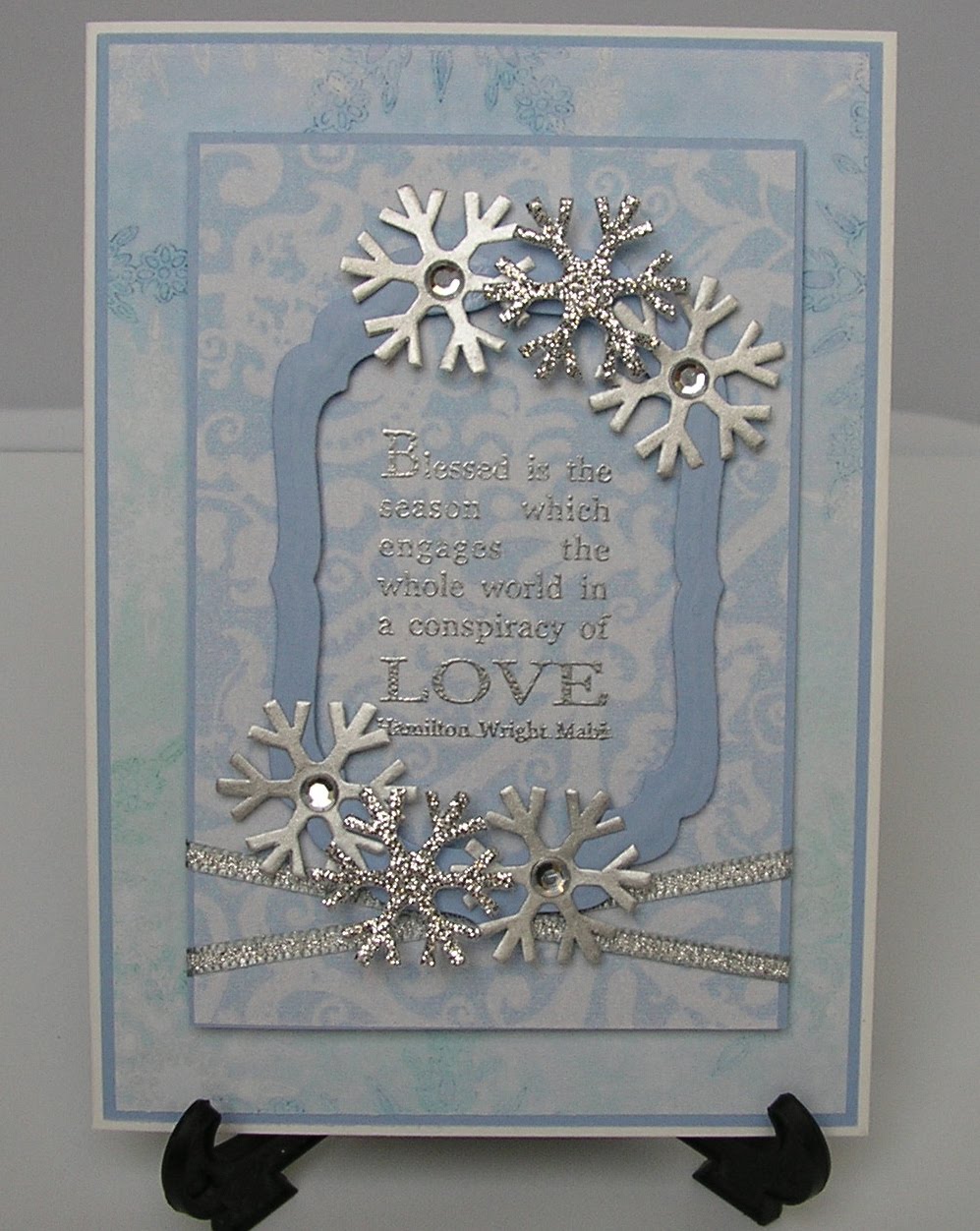
I mentioned earlier that I might pop back with a Christmas card. Well here it is.
  The design is based on a card by Andrea which I cased shamlessly. You can find her original and beautiful card HERE.
I think I went a bit over the top with the blue and maybe should have put a contrast with it but it`s done now and I do quite like it.
The DP are both from Elusive Images Artilicious Christmas Greetings CD.
The sentiment stamp is also by EI and is embossed in detail silver.
I`ve added a frame made with nestie labels 4 dies and placed it over the sentiment.
Then I just added some ready made snowflakes, a couple of plain gems to some and some silver ribbon.

Alan`s painting the kitchen and dining room today so I`m hiding in my craft room. As I usually do the decorating I do tend to interfere a bit and tell him how I would do it so I think it`s best for both of us if I stay out of the way. I did sneak down earlier to throw a quick meal together and he`d sandpapered all the woodwork and left the living room door open. All the cleaning I did yesterday is now 1/2 an inch deep in dust but I was a good wife, I bit my tongue and didn`t say a word.  ( Took some doing though) Lol.
He`s got the whole week off so I might be spending even more time locked away in the loft hee hee!

Thanks for popping in...Lynne xxx

Saturday, 11 September 2010

The Play Date Cafe Challenge # 46

Good Afternoon and a Happy Saturday to You All!

The girls at The Play Date Cafe have given us a colour splash this week.
Which means we are to use Black & White with a splash of Pink, Copper or Gold. Naturally I went with pink.
For once this card turned out exactly how I imagined it would. I don`t think that`s ever happened to me before !!!

I stamped up a background stamp from Elusive Images Damask Delights set in black and heat embossed it to give it some depth.
I matted that onto some Hot Pink card and cut leaving a small border.
I`ve added 2 small heartshaped pink gems.
The sentment is from Flourishes Tag Lines stamped in pink.
And that`s it, no frills, no ribbons and no bows. Just a quick simple card.

Right I`m off to challenge myself with some more challenges. See you later.

Thanks for popping in...Lynne xxx